FITQOR | BRANDING
-
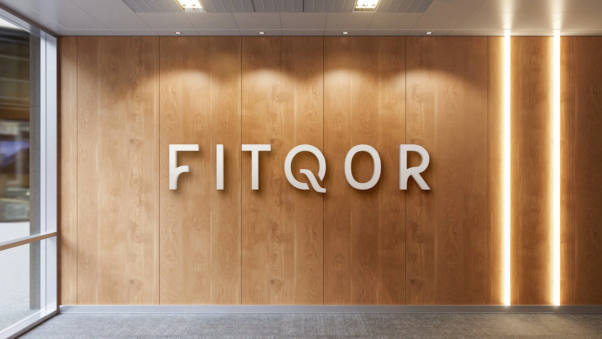
The challenge with FITQOR was clear, create a brand identity that would convey elegance, trust, and a premium positioning, while aligning seamlessly with the architecture of the club itself. The letter “Q” in the name posed a unique design hurdle, visually difficult yet central to the brand. Our task was to transform this into a strength rather than a weakness.
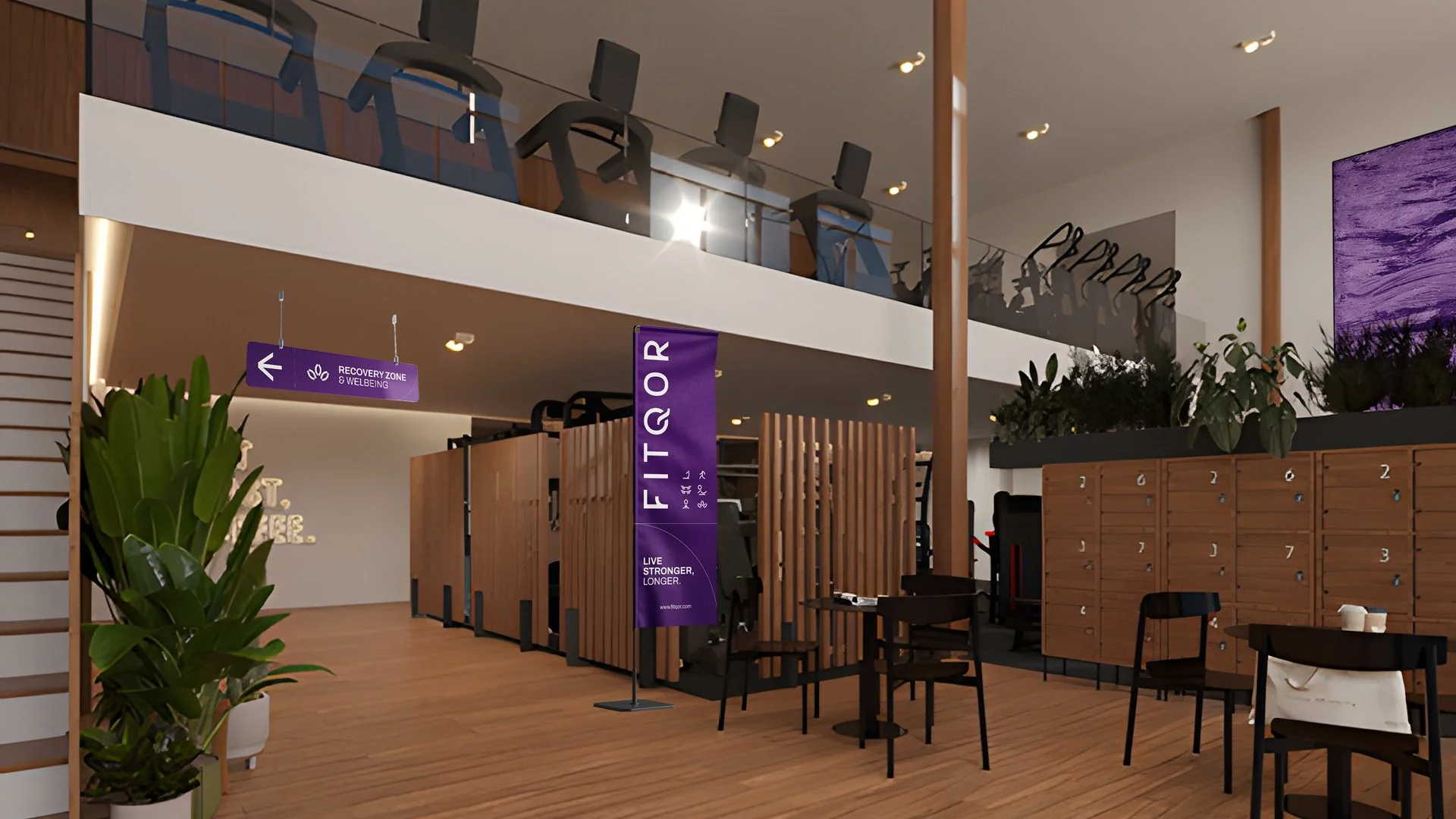
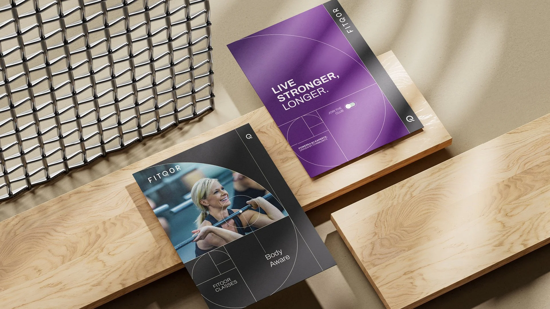
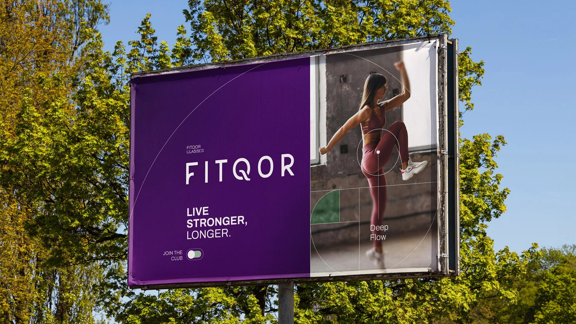
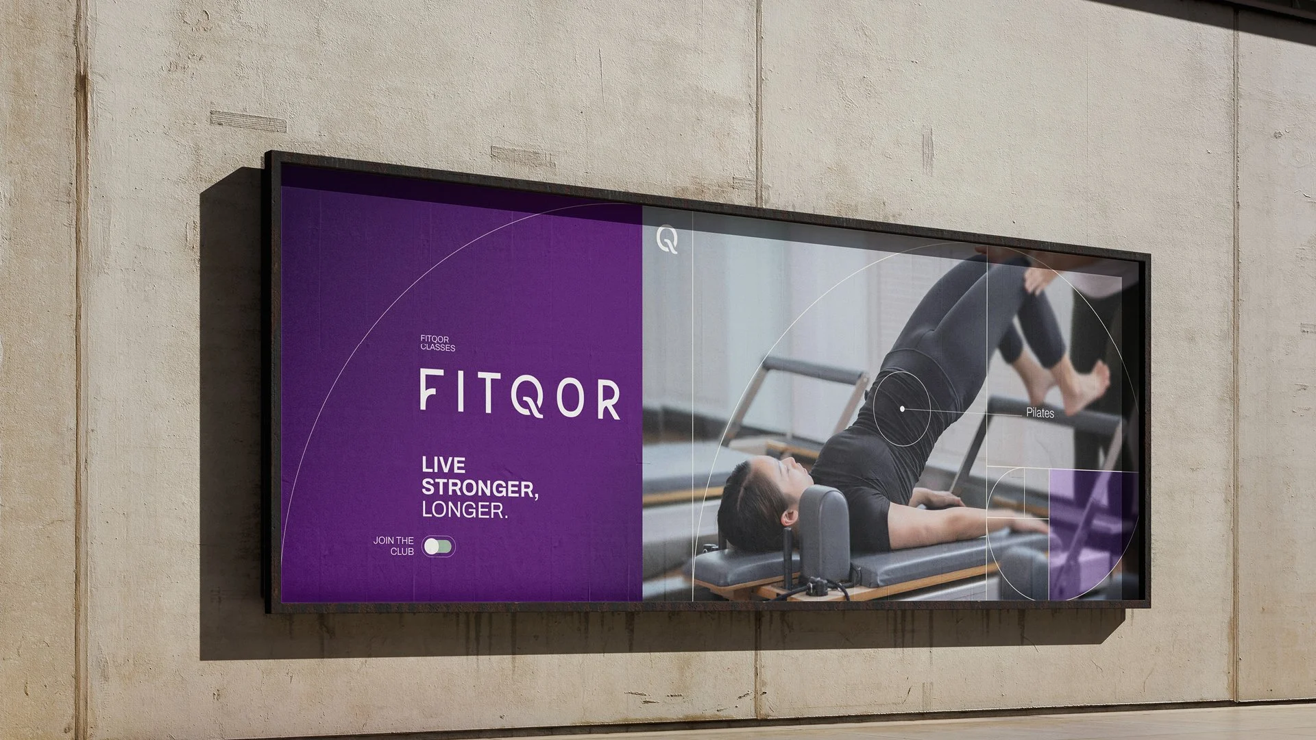
What distinguishes FITQOR is its philosophy: strength training as the foundation for a long, healthy life. It’s not just about fitness, but about enjoying every moment with full physical availability, independence, and focus, building a proud, resilient longevity.
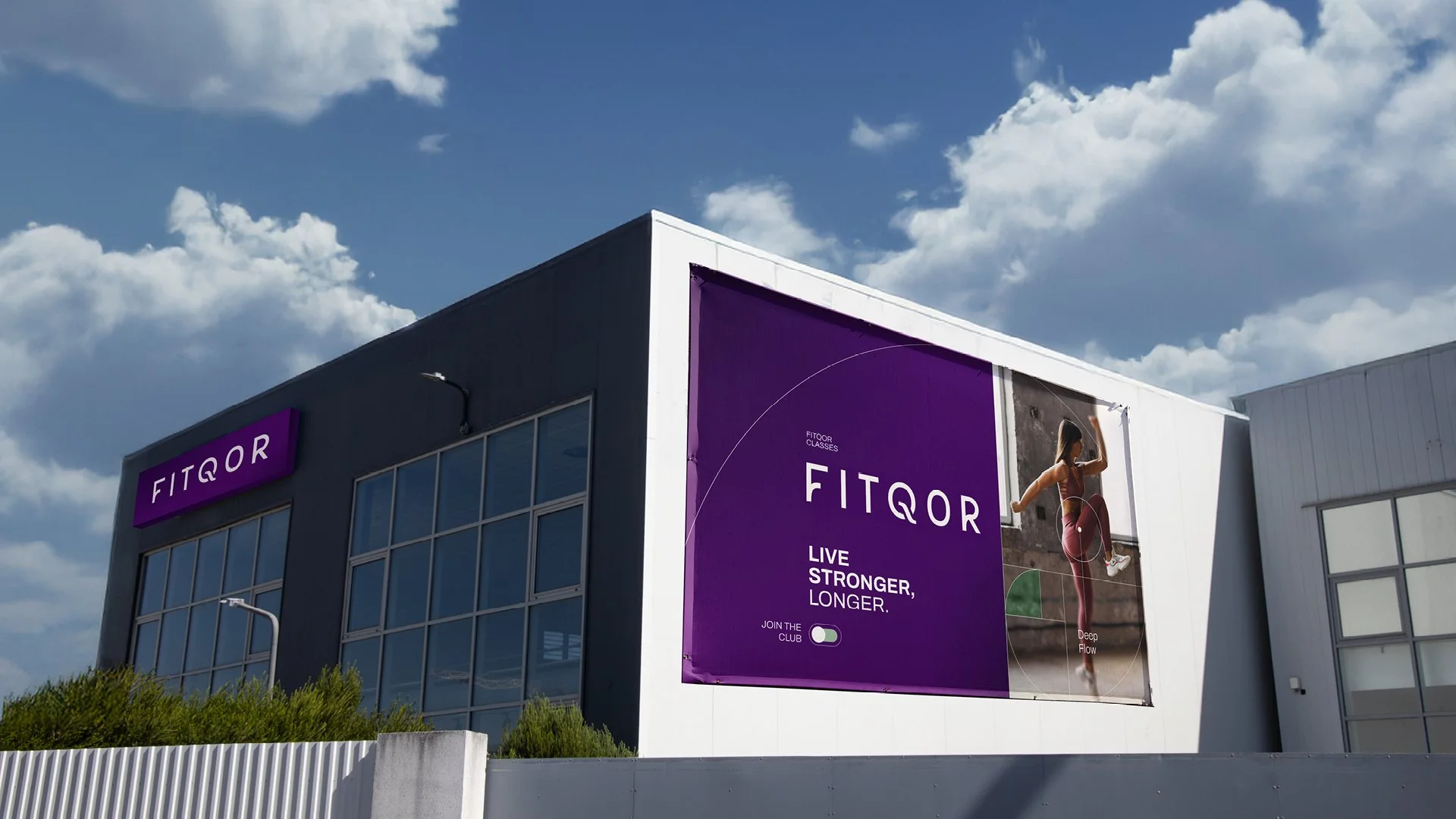
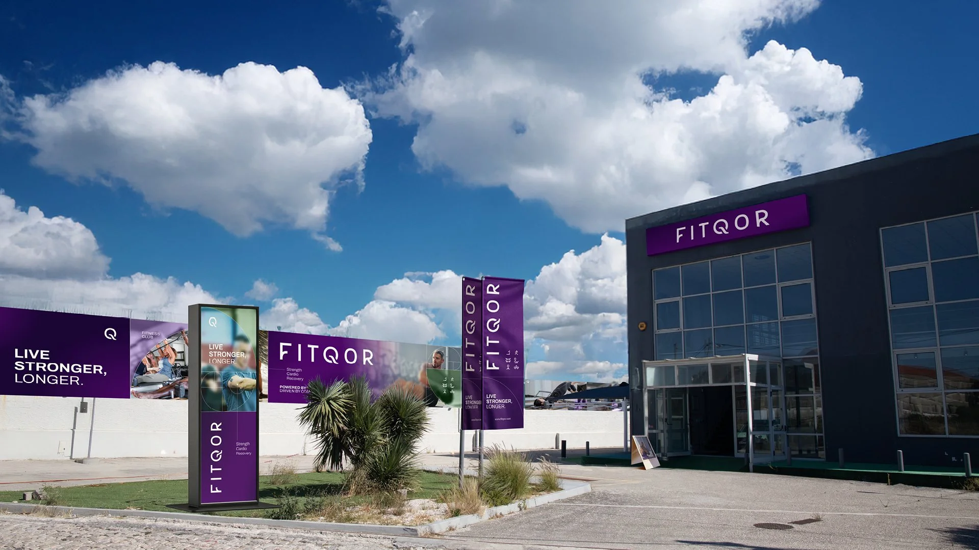
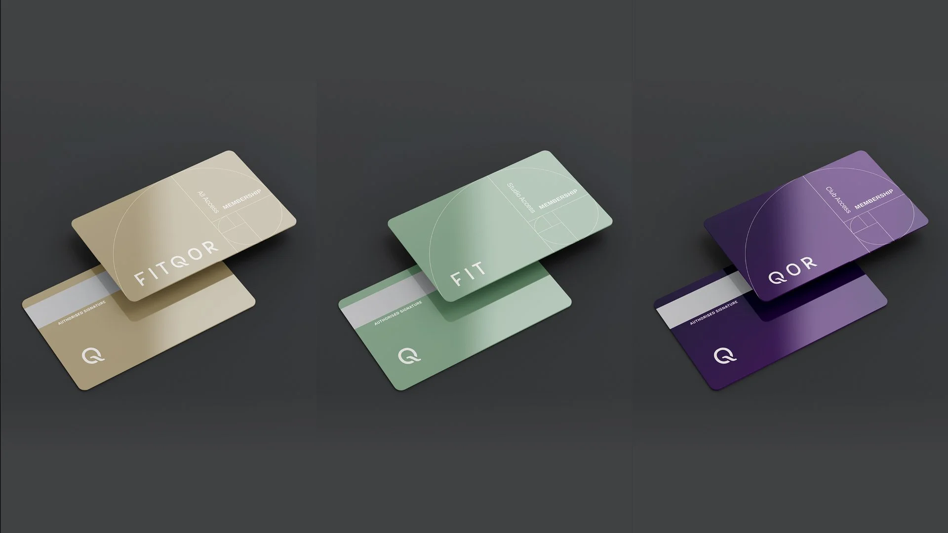
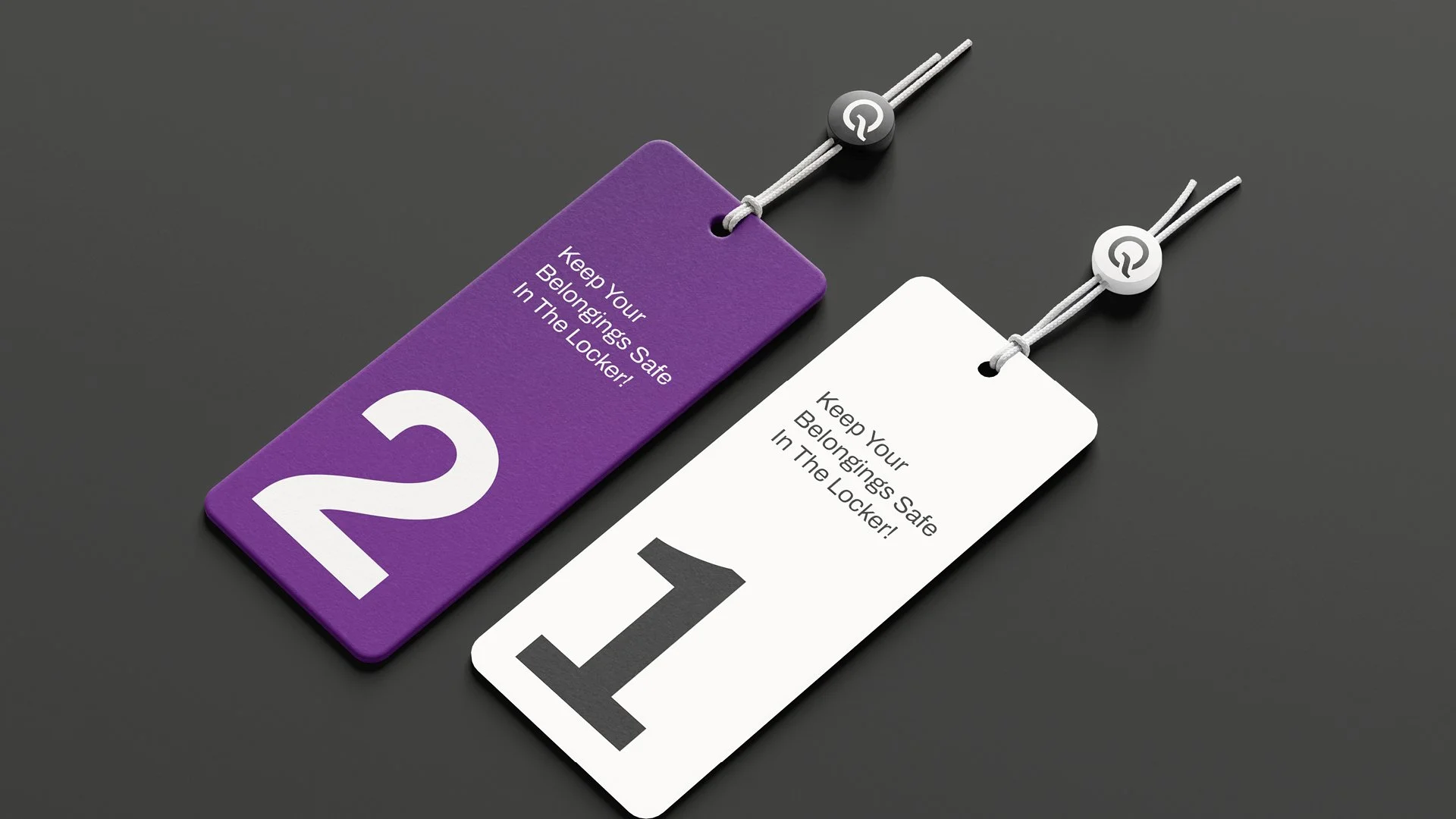
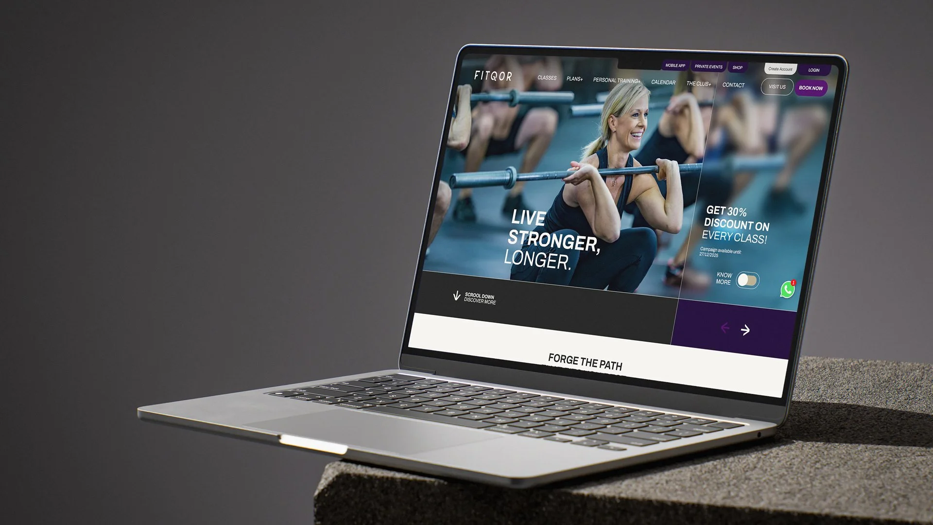
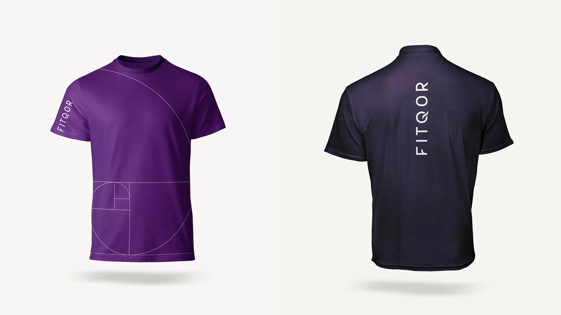
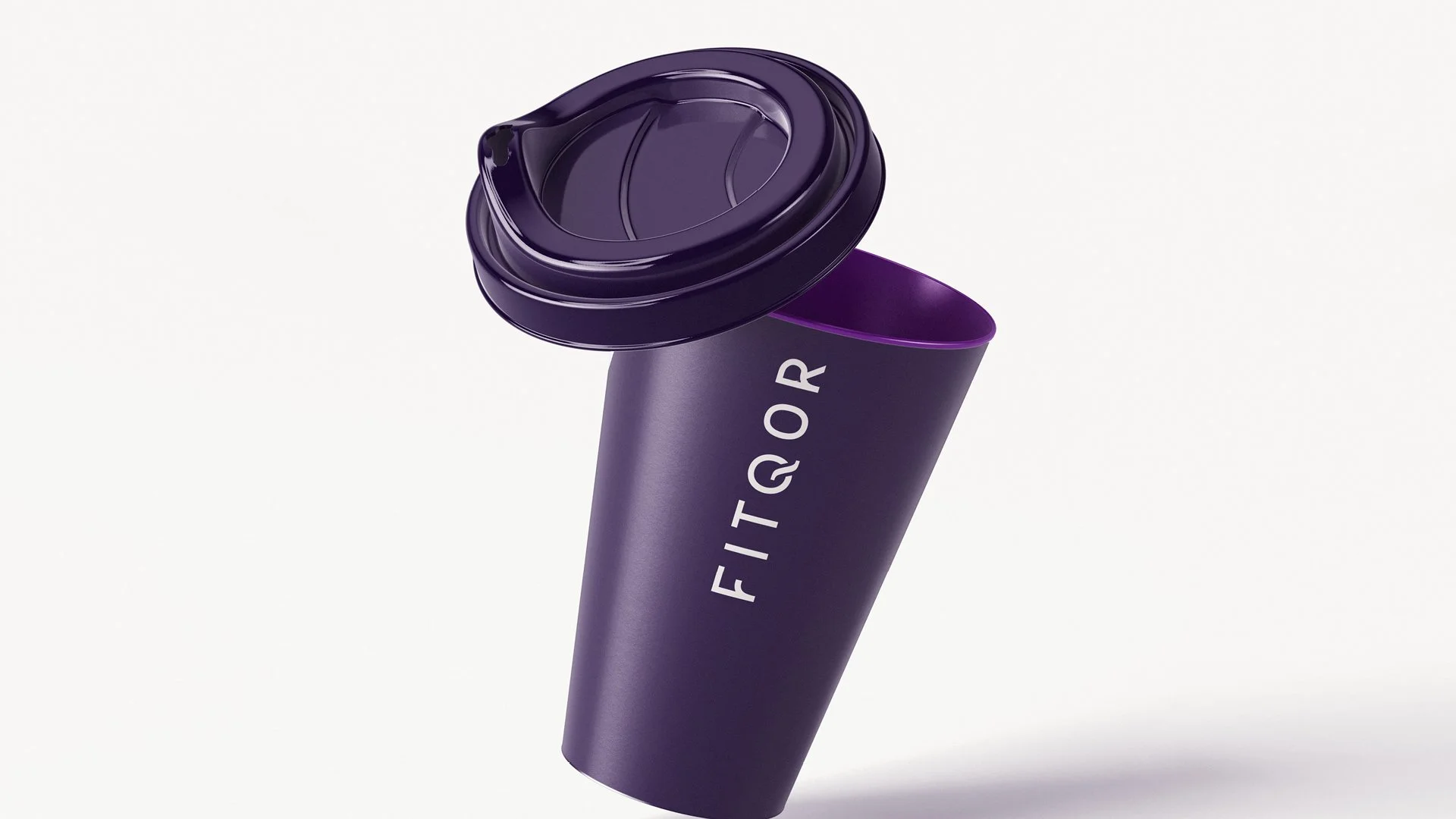
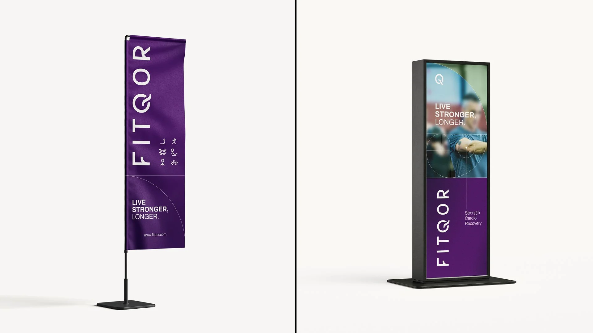
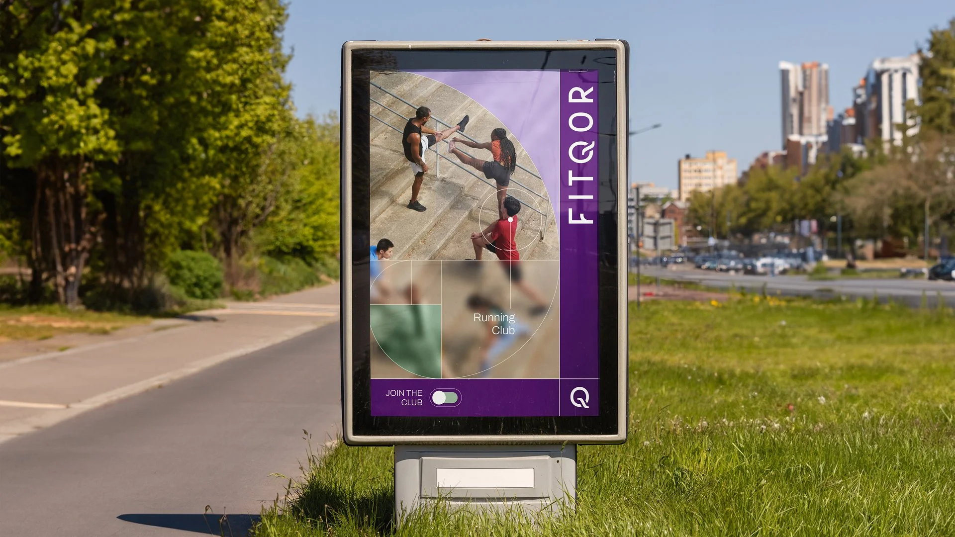
To reflect this mindset, the brand’s visual identity embraces a bold but refined color palette: imperial purple, sage green, charcoal, sand, and accented with matte gold. These tones were chosen to evoke pride, sophistication, and emotional resonance.
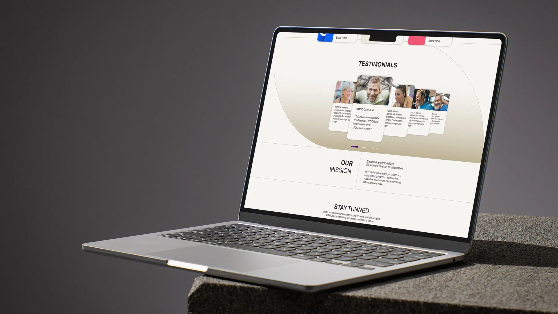
We incorporated the golden ratio into the branding system, not overtly in the symbol or logo, but subtly within layouts and proportions, reinforcing harmony and balance. The visual language plays with contrast: blurred imagery paired with sharp focal points, guiding attention and communicating the club’s philosophy of focus, clarity, and precision.
The result is a brand that feels premium yet approachable, sophisticated yet powerful, perfectly aligned with FITQOR’s mission to build a community grounded in strength and longevity.
-
Art Director: Tomás Delft
Client: FITQOR
Art Direction & Branding
Webdesign